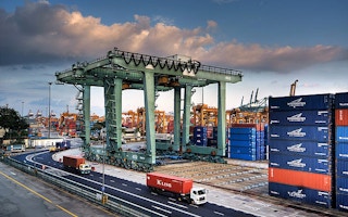
While the US and many European countries have reduced their domestic emissions over recent decades, some of this reduction has been offset by increasing imports from countries, such as China, that have a more carbon-intensive energy mix.
Even though domestic emissions have fallen 27 per cent in the UK between 1990 and 2014, once CO2 imports from trade are considered this drops to only an 11 per cent reduction. Similarly, a 9 per cent increase in domestic US emissions since 1990 turns out to be a 17 per cent increase when trade is included.
Including emissions outsourced to other countries provides a more complete picture of the true responsibility associated with a country’s actions. It also accounts for carbon transfers associated with the decline of the manufacturing sector in the developed world.
Carbon Brief has mapped out exports and imports of CO2 globally, and examines how including them changes countries’ national CO2 emissions.
Trading responsibility
There is a fundamental question of who is responsible for emissions: the countries that directly emit CO2, or the countries that purchase goods associated with those CO2 emissions?
By tracking “consumption emissions” that account for imported CO2 from trade, researchers can, to some extent, account for carbon transfers associated with the decline of manufacturing in developed countries over the past few decades.
Currently, national emissions inventories conducted under the UN Framework Convention on Climate Change (UNFCCC) only consider emissions that occur within the borders of each country. Responsibility for emissions associated with trade remains with the exporting nation.
This approach has the benefit of being straightforward and reflecting a degree of control over emissions within borders, but penalises countries for emissions associated with goods that they do not consume domestically.
Researchers led by Dr Steve Davis at UC Irvine constructed a global database of CO2 imports and exports back in 2010. Their database, now maintained and updated by the Global Carbon Project, estimates both domestic emissions only (CO2 production) and emissions once CO2 embodied in both imports and exports have been included (CO2 consumption).
To calculate the size of CO2 imports, they use an input-output model that accounts for the flow of different types of goods between countries, as well as information about the carbon intensity of electricity and industrial production in different countries. While this approach has large uncertainties, it captures the energy and emissions embodied in traded goods for the entire globe.
The interactive map below shows the net CO2 transfers for each country in 2014, with positive values in red representing countries that are net CO2 importers and negative values in blue showing net CO2 exporters.
For example, India is blue because considerably more emissions go into producing the goods that it exports to other countries than to create the goods it imports from other countries.
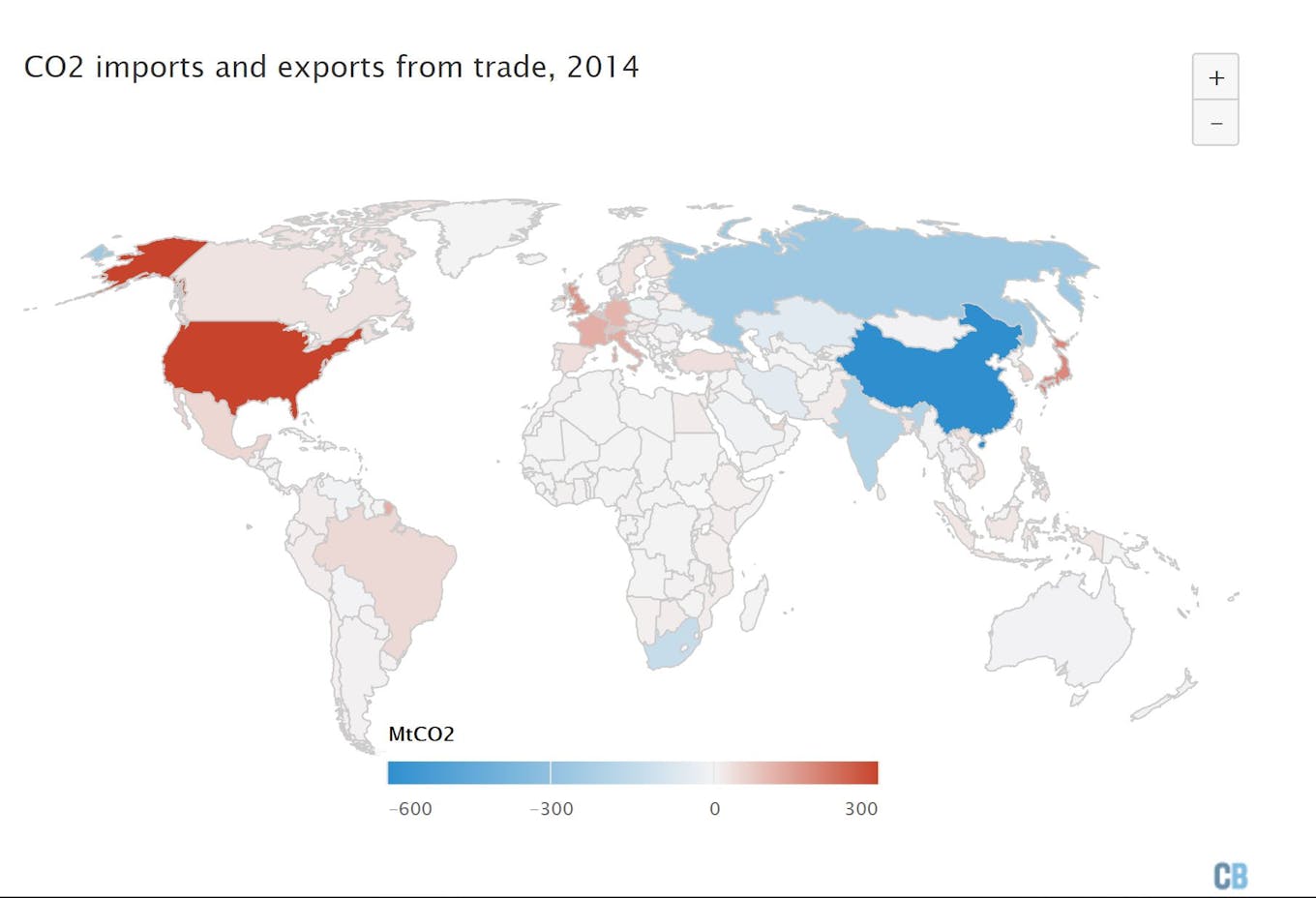
Global CO2 imports and exports from trade in 2014. Based on data from the Global Carbon Project. Note that 2014 is the latest year where CO2 import/export data is available. Also note that the scale goes from -600 to 300MtCO2. View the interactive chart here. Chart by Carbon Brief using Highcharts.
China is the largest net exporter of CO2 by far, with the second largest – Russia – exporting only a fifth as much. Similarly, the US is the largest net CO2 importer, importing around twice as much as Japan.
However, countries can be somewhat hard to compare due to the size of their economy having a large impact on resulting carbon transfers. Another way to visualise CO2 imports is to look at them as a share of domestic emissions, as shown in the figure below:
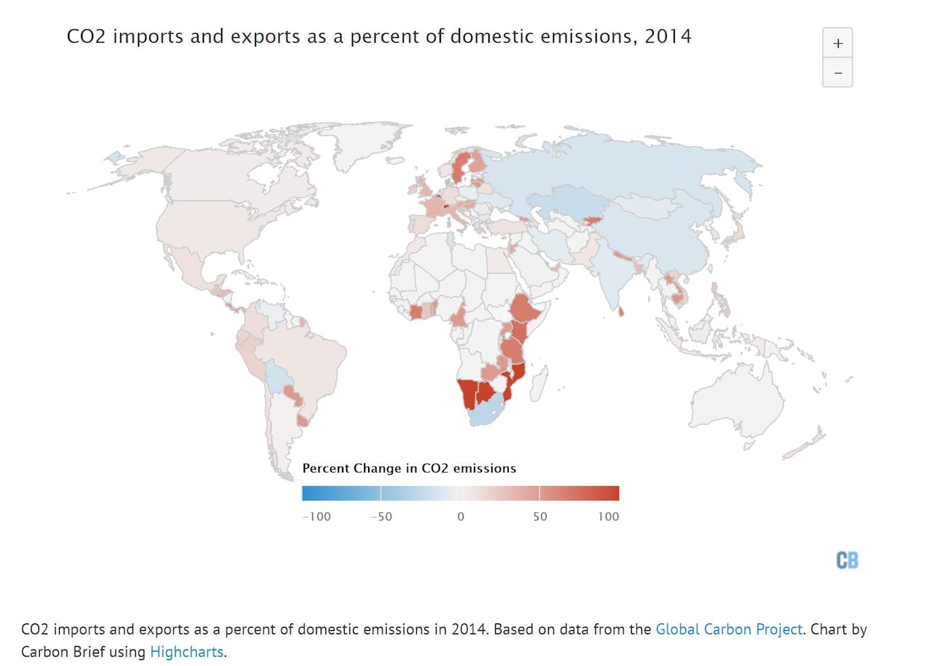
View the interactive chart here.
Despite the large total of CO2 imports and exports, US emissions are only 6 per cent higher and Chinese emissions are 13 per cent lower when CO2 transfers are taken into account.
In many European countries, the carbon embedded in imported goods and services amounts to more than 30 per cent of domestic emissions. In one extreme case, Switzerland’s emissions are 209 per cent higher (more than three times as large) once CO2 imports are taken into account, due to large imports and exports containing little in the way of embedded carbon.
Some of the larger CO2 exports come from the Middle East and Russia, even though they do not export large quantities of manufactured goods. This is because CO2 imports can include both the direct emissions associated with producing goods, as well as indirect emissions from mining and processing.
For example, Russia exports a lot of natural gas and oil, and when those fuels are burned their emissions are already accounted for in the national inventories of importing nations.
However, there are large upstream emissions associated with the extraction and processing of fossil fuels intended for export. Some of these values would be even higher if non-CO2 greenhouse gases (GHGs), such as methane, were taken into account, though for now these analyses focus primarily on CO2.
The chart below shows the countries with the 30 largest positive or negative CO2 transfers and what per cent of their domestic emissions those transfers comprise.
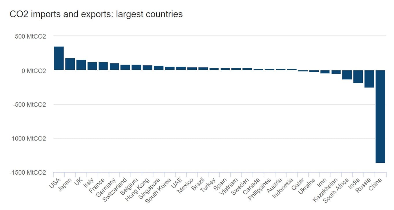
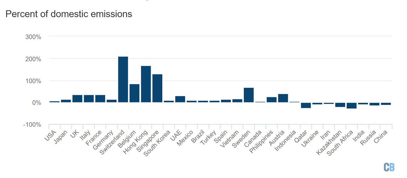
Net CO2 transfers associated with trade, both total (top) and percent of domestic emissions (bottom). Based on data from the Global Carbon Project. Chart by Carbon Brief using Highcharts.
Emission reductions through outsourcing
The argument has often been made that emissions reductions by countries, such as the US and UK, are in part driven by the outsourcing of manufacturing to carbon-intensive countries, such as China. To examine the extent to which this is true, the change in emissions for a number of notable countries is shown in the figure below.
Consumption emissions, which include imported and exported CO2, are shown in orange, while domestic production emissions that exclude trade are shown in blue. The blue lines are the reported values in emission inventories, which countries use to measure progress against carbon reduction targets.
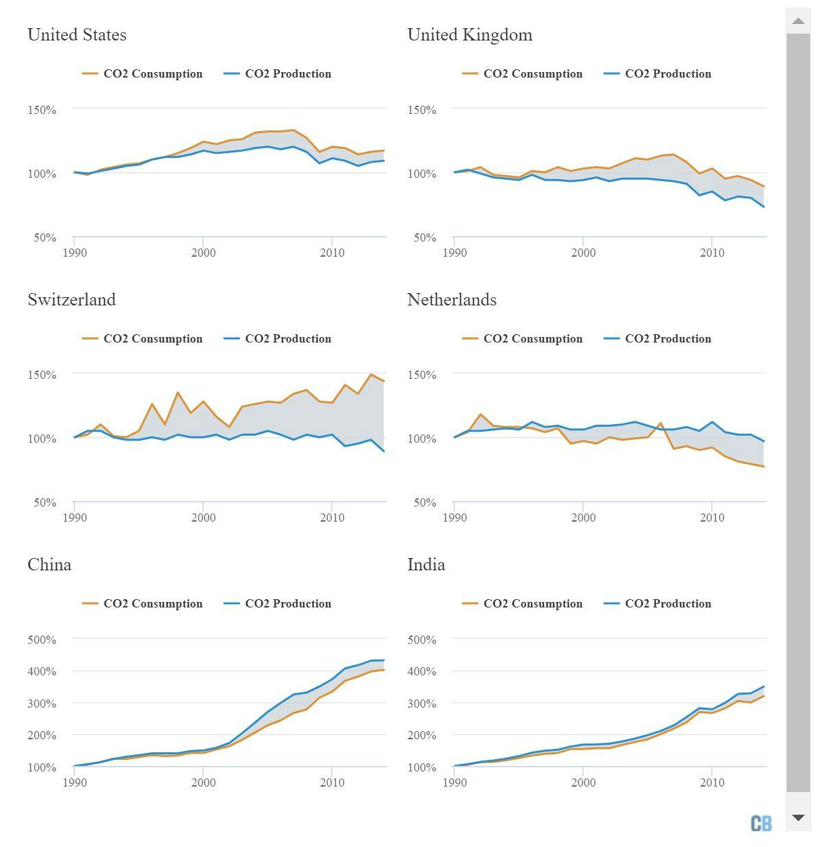
Countries’ consumption (orange line) and production (blue) emissions as a percent of their 1990 emissions. The grey area represents the difference between the two. Based on data from the Global Carbon Project. Chart by Carbon Brief using Highcharts.
When imported carbon is included, most developed countries have smaller emission reductions – or larger increases in emissions – since 1990. Prior to 1995 or so, most countries had a relatively small difference between consumption emissions and production emissions.
After the late 1990s, however, large amounts of manufacturing has shifted from developed countries to developing countries – in particular, to China.
Between 1990 and 2014, UK domestic CO2 production emissions have fallen 27 per cent. However, more than half of that reduction is offset by imported emissions from other countries, with consumption emissions only declining by 11 per cent over the same period.
Similarly, US production emissions have increased 9 per cent since 1990, while consumption emissions increased by twice as much.
Switzerland is a particularly interesting case, with production emissions falling 11 per cent, but consumption emissions increasing by 44 per cent since 1990. On the flip side, while the Netherlands’ production emissions have only decreased by 3 per cent, their consumption emissions have actually decreased by a much larger 22 per cent.
China and India have both seen dramatic increases in emissions since 1990. Despite the massive expansion of exports, particularly from China, their emissions are still mostly due to domestic consumption.
China’s production emissions have increased by 430 per cent, while their consumption emissions have increased by a slightly lower 400 per cent. Similarly, India’s production emissions have increased by 349 per cent and their consumption emissions by 319 per cent.
Since 2007, however, imported carbon emissions have remained roughly constant in the UK and actually declined slightly in the US. There is not much evidence that reductions over the past decade have been offset by outsourcing of manufacturing in most countries.
CO2 exports from China have actually decreased by around 25 per cent from their peak in 2007, though they are still increasing in India. Some of this is due to growing imports of goods to China and India associated with an expanding middle class, which helps balance out CO2 exports.
In general, developed countries with lower per-capita emissions will have a higher portion of their CO2 emissions from imports and lower counterbalancing CO2 emissions from their exports.
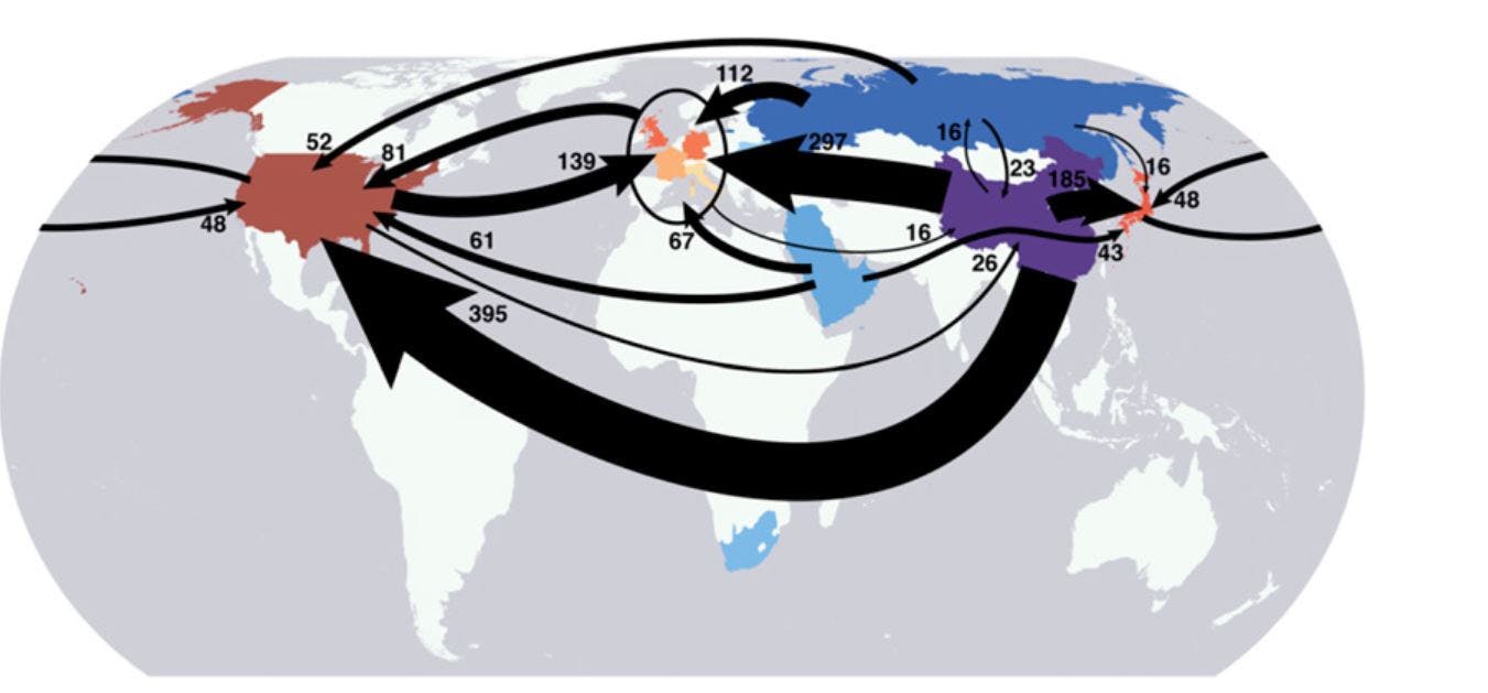
Global emission transfers between countries in 2004 in millions of tonnes of CO2 (MtCO2), taken from Figure 1 in Davis and Caldeira 2010.
The figure above, from Steve Davis’ 2010 paper, shows the flow of CO2 embodied in trade between countries. While somewhat dated, as it uses 2004 trade data, it clearly shows the large flows of CO2 out of China and into the US, Europe, and Japan. At that time, the US was a net exporter of CO2 to Europe, with the CO2 intensity of its exports exceeding its imports.
These estimates of the CO2 embodied in trade are subject to a relatively high level of uncertainty, particularly for smaller countries, and independent national-level estimates do not always agree perfectly with the global dataset discussed here.
Conclusion
National emissions inventories that only account for CO2 emitted within national borders exclude large CO2 transfers associated with international trade. These transfers have grown dramatically since the early 1990s, accounting for a growing share of total consumption emissions of most developed countries.
This growth in consumption emissions in developed countries has hampered overall progress to cut total CO2 emissions over the past few decades. Once the CO2 imports are considered, the decarbonisation achieved by many developed countries is much smaller than would otherwise appear.
Since the recent financial crisis of 2007/2008, however, net CO2 emissions from trade have remained relatively flat for many countries, or even declined. Net CO2 imports in developed countries have decreased around 29 per cent since 2007, driven in part by increasing imports of developed country goods into developing countries.
This story was published with permission from Carbon Brief.

