Global average temperatures for next year are expected to hit a new high since records began in 1850, says a UK Met Office outlook.
At 0.84C above the 1961-90 average, the Met Office says 2016 “is likely to be at least as warm, if not warmer” than 2015.
Top spot
A few weeks ago, the World Meteorological Organisation (WMO) announced that 2015 is likely to be ranked as the hottest year in modern observations. Today, the Met Office says 2016 will likely knock it straight off top spot.
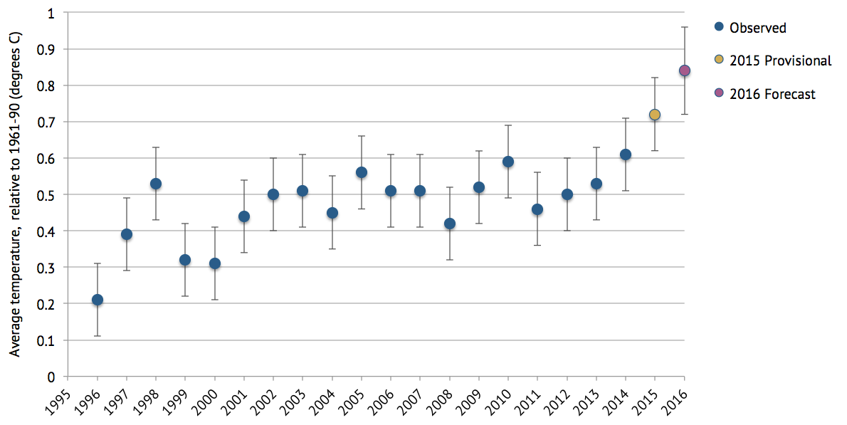
According to their annual outlook for the year ahead, 2016 is expected to be between 0.72C and 0.96C above the 1961-1990 average of 14.0C, with a most-likely estimate of 0.84C. You can see how this compares to the last 20 years in the chart below.

Global average temperature (in degrees C) relative to 1961-90 average, for observed (1996-2014), provisional (2015) and forecast (2016) years. Error bars are +/- 0.1C for observed and provisional data, and +/- 0.12C for 2016. Data from WMO and Met Office; chart by Carbon Brief.
The likely record warming of both 2015 and 2016 is down to a combination of rising greenhouse gases and a “smaller” contribution from the strong El Niño underway in the Pacific, the Met Office says. El Niño events normally peak around the turn of the year, meaning an event tends to influence global temperatures for at least two years.
In a press release, Prof Adam Scaife, head of long-range prediction at the Met Office, said: “This forecast suggests that by the end of 2016 we will have seen three record, or near-record years in a row for global temperatures.”
The Met Office says it doesn’t expect temperature records to be broken every year, but “the current situation shows how global warming can combine with smaller, natural fluctuations to push our climate to levels of warmth which are unprecedented in the data records”.
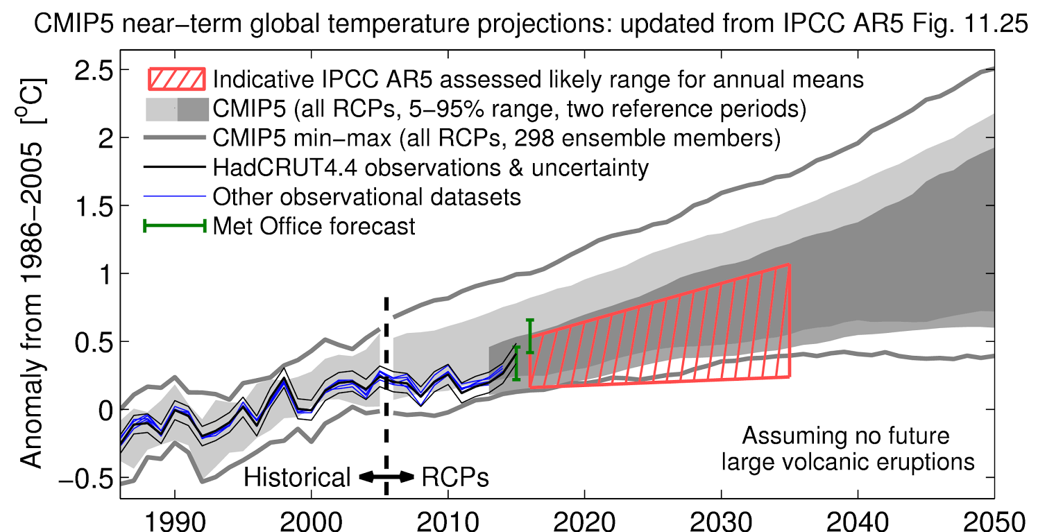
In response to the new Met Office forecast, Dr Ed Hawkins, an associate professor at the University of Reading, told Carbon Brief: “The Met Office’s 2016 forecast is certainly dramatic and, if realised, would be towards the upper end of the range predicted by the IPCC in their most recent Assessment Report.”
You can see this in the chart below, which comes from the IPCC’s Fifth Assessment report and has been updated by Hawkins. The red hatched area indicates the “likely” global average temperature rise expected by the IPCC, and the green bars show how the Met Office’s forecasts for 2015 and 2016 compare.

Near-term projections of global average temperature, updated with latest global temperature observations and forecasts. Shows observed temperature (black and blue lines) model projections relative to 1986-2005 (light grey shading) and 2006-2012 (dark grey), and Met Office forecasts for 2015 and 2016 (green bars). Original figure from IPCC report, updated by Ed Hawkins.
Forecasts
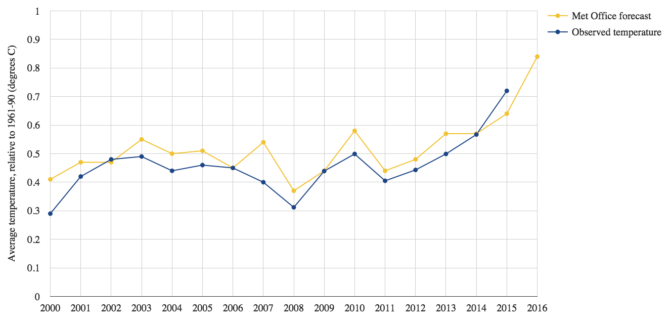
The Met Office has been predicting global temperatures one year in advance since 1999. In January, Carbon Brief looked back at some of these forecasts and how they are made. The chart below shows that they tend to match well with the ups and downs of annual temperature.

Comparison of Met Office forecast and observed global average temperatures. Observations for 2014 and 2015 cover Jan-Nov and Jan-Oct, respectively. Data provided by the Met Office, chart by Carbon Brief.
On 17 December 2014, for example, the Met Office made its forecast for 2015: “The global mean temperature for 2015 is expected to be between 0.52C and 0.76C above the long-term (1961-1990) average of 14.0C, with a central estimate of 0.64C.”
According to a Met Office, data from January to October this year puts 2015 at 0.72C above the 1961-90 average – to within 0.1C either side of that figure.
This at the upper end of the temperature range put forward in their prediction last year, though 2015 hasn’t quite finished yet, so the final figure may well change again.
The Met Office also expects global average temperatures in 2015 to hit 1C of warming since pre-industrial times (1850-1900).


